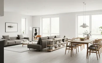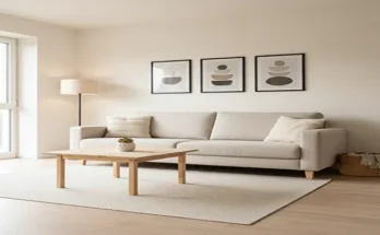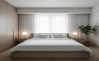
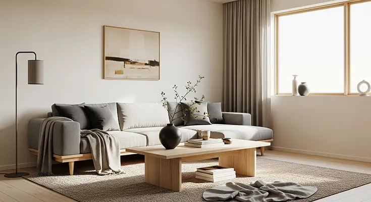
The Japandi aesthetic—a harmonious blend of Japanese minimalism and Scandinavian hygge—is more than just a trend; it’s a design philosophy centered on tranquility, functionality, and connection to nature. At the heart of this serene style lies its carefully curated color palette, which forms the foundation for a calm, uncluttered, and inviting living space.
The Japandi color palette is characterized by its quiet confidence. It avoids jarring contrasts and overly vibrant hues, instead relying on layered neutrals, earthy tones, and natural accents to create an atmosphere of peaceful sophistication.
The Foundation: Layered Neutrals
The base of any Japandi interior is a soft, light-filled backdrop, heavily influenced by the pale, airy colors of Scandinavian design. These colors maximize light and create a feeling of openness.
- Soft Whites and Off-Whites: These form the primary canvas for walls and ceilings, but unlike stark, cool whites, Japandi favors warm variations. Think creamy whites, ecru, and alabaster—shades that feel gentle and inviting, preventing the space from feeling cold or sterile.
- Muted Beiges and Taupes: These warm neutrals are crucial for adding depth and coziness. They bridge the gap between white walls and wood elements, often used for large furniture pieces like sofas, linen curtains, or rugs.
- Neutral Grays: Ranging from light ash to stone gray, these colors provide a subtle, cool contrast to the warmer whites and beiges, grounding the space without sacrificing the airy feel.
The Grounding Force: Earthy Hues
To add the natural warmth and grounding element inspired by Japanese design and the concept of wabi-sabi (finding beauty in imperfection), the palette incorporates rich, natural earth tones.
- Warm Browns: Derived primarily from the use of natural wood, from light oak and ash to deep walnut and chestnut, these tones are essential for flooring, furniture, and exposed structural elements. The wood’s natural grain and texture add organic warmth.
- Soft Tans and Sands: These shades reflect the raw elements of nature, such as clay and natural fibers. They are often introduced through textiles like linen, wool, and jute, and ceramic pottery.
- Muted Clay and Terracotta: Used in accessories or subtle wall treatments, these colors add a hint of warm, subtle color and texture, reinforcing the connection to the earth.
The Contrast: Black Accents
To prevent the space from becoming visually flat and to introduce the clean, precise lines often seen in traditional Japanese architecture, black or deep charcoal is used sparingly but strategically.
- Charcoal and Matte Black: These dark tones are typically employed as sharp accents, grounding the overall design. Look for them in window frames, lighting fixtures, furniture legs, hardware, or a single, carefully chosen piece of decorative pottery. This contrast provides visual definition and sophistication.
The Pop of Life: Nature’s Greens
While the overall palette is muted, a deliberate splash of color is introduced to symbolize nature, a cornerstone of both design styles.
- Sage and Moss Green: These soft, muted greens are the most common accent color, often introduced through indoor plants (like a minimalist bonsai or a simple, tall floor plant), or in textiles, artwork, and smaller decorative items. They are calm, organic, and perfectly complement the natural wood and neutral bases.
- Subtle Blues: Occasional use of a dusty or muted blue, sometimes drawing inspiration from indigo, can introduce a cool, serene note without disrupting the tranquility.
Key Takeaway for Implementation
To successfully adopt the Japandi color palette, remember the principle of balance and layering:
- Start with a Neutral Base: Cover your largest surfaces (walls, ceilings) in soft whites, light beiges, or warm grays.
- Layer in Warmth: Introduce wood tones and earthy hues through furniture and natural materials.
- Use Accents Sparingly: Reserve deep blacks for contrast and sharp lines, and use muted greens or soft pastels for a subtle, life-giving pop of color.
By focusing on these deliberate, nature-inspired colors, the Japandi palette creates a space that feels inherently balanced, mindfully minimalist, and profoundly tranquil—a true haven from the outside world.